

The process of creating custom coasters is not to plaster a logo onto the square or round surface. It is a process that involves being precise in the layout, approach to branding strategy, nd a pleasing aspect to make something useful and memorable. Regardless of business promotions, individual functions, and retail products and sales, coasters create an unusual platform to keep a personality. With an optimal layout, your message becomes legible, distributed, and easy on the eyes. All the choices of design, such as colors, fonts, and image position, should be deliberate. The trick to developing outstanding personalized coasters that make a strong impact is through the ability to know how to place these aspects well.
Design Basics
Coming up with the ideal design of coasters begins with learning the fundamentals of design. There is not much surface area of the coaster to work with, so space should be utilized well. Put an accent on clarity and simplicity to make sure that the design is attractive and can be read easily. Use colors and fonts that are complementary. Do not put a lot into the design. Sensitive information should be in the middle so that it is not cut. The design must have a good balance of text and graphics to create the utmost impact.
Color Selection
A color is a determining factor in the charm of personalized coasters. A proper color scheme is the determinant of your design. Select the background colors that will not clash but are in line with your brand or event theme. Try out colors on the coaster material such that they seem vivid and clear once they are printed out. Avoid background and faded colors. When it comes to the palette, restrict it to either two or three primary colors to have visual harmony. The uniformity of color makes your coasters shine in whichever ambiance.
Image Placement
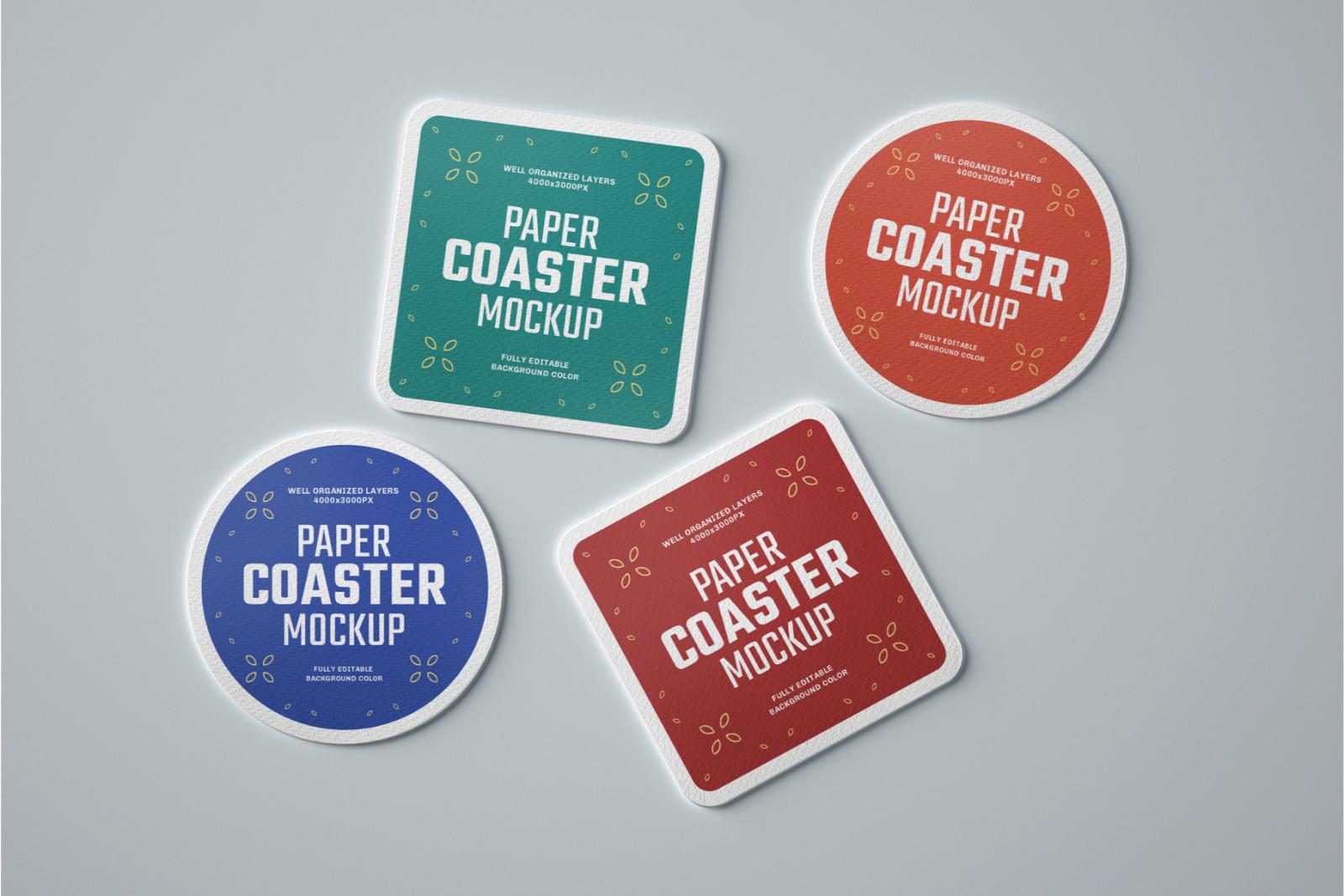
The placement of strategy images is important in the design of coasters in bulk. Put valuable pictures or logos in the center to ensure they are the center of the attraction. Never put important stuff near the edges where there is a possibility of making trim errors in production. You may think of the figure of the coaster to be round, square, or another shape, and adapt the image. Prevent pixels by using high-resolution pictures. Arrange position graphics to the center so that they are balanced or to the side so that the result is dynamic. The objective is a finish that is professional and clean.
Typography Choices
If a design is used in coaster printing, typography may either add quality or subtract it. Choose fonts that are easy to read, even in a small size. Use only two fonts in order to maintain the layout clear and sensible layout. Avoid too fancy fonts, which compromise legibility. Use font typefaces and weights to give hierarchy to the text. Before finalisation, make sure you have tried your typography on the actual size of the coaster. There is good typography that expresses the message effectively in a classy way.
Branding Focus
Coasters that are custom-designed for businesses are vital in terms of brand consistency. Write logos, taglines, or brand colors in the layout . Alignment and spacing should be maintained to maintain professional design. To strengthen identity, use fonts and style specifications of your brand. Make the elements of the branding not dominate the design. Coasters are little billboards; therefore, being clear and having recall value is desirable. There is a sense of trust and familiarity created by a common appearance.
Functionality Matters
Other than aesthetics, functionality has an influence on successful customized coasters. Think about the purpose of using a coaster, e.g., to drink, as a gift, or a tata promotional event. Employ a material and finish that is relevant to the layout but does not affect usability. Avoid designs that could be worn out soon or affect usability. There must be a balance between what looks good, longevity, nd cleanability. The design is supposed to reveal the layout, which should increase user experience. There is no way of separating practicality and beauty.
Event Specifics
When you customize your coaster design to specific events, it increases the utility of their branded coasters. In the case of a wedding, one should use fancy fonts and light colors that are put across according to the theme of the Printed papers design.. To feature in a promotional event, use bold types of logos and contact information. Apply custom designs to holidays or a seasonal promotion by using appropriate icons and patterns. Scale the layout to the audience, size, and the number of people participating in an event. Coasters are personalized and easy-to-remember favors. Conversion of layouts enhances value and emotions.
Conclusion
The design of the layouts of the custom coasters involves creativity and accuracy. Every type of design, including color and typography, contributes to the formation of a coherent and effective coaster. The design is more effective when one focuses on branding and on the needs of events. Design makes the coaster practical as it will be beautiful and functional. The layout can be developed and tested before printing, thus avoiding costly errors. Taken in combination, these steps produce personalized coasters that are impressive and durable. Spend time on layouts to make a custom coaster really special.